
Gerard Huerta on Designing AC/DC, Boston, Blue Öyster Cult Logos and Rock’s Most Iconic Branding
Mar 20, 2026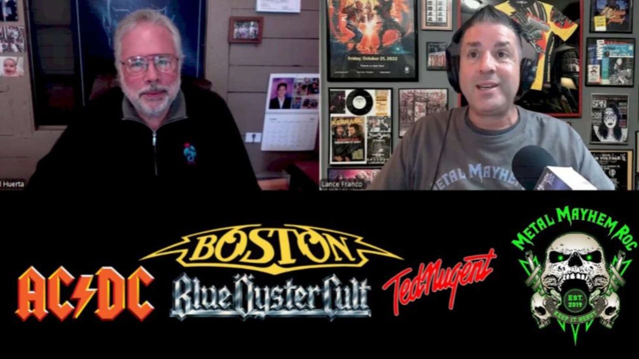
In an era where music branding is often reduced to thumbnails and streaming icons, Gerard Huerta represents a different kind of creative origin story—one rooted in craftsmanship, intuition, and a drawing board. While many may not immediately recognize his name, his work is embedded in the DNA of rock culture, from AC/DC to Boston to Blue Öyster Cult.
In this conversation with Metal Mayhem ROC, Huerta reflects not on legacy, but on process—how a career built on lettering, discipline, and adaptability continues to evolve in today’s design landscape. What emerges is not nostalgia, but a clear-eyed view of how creative work is made, then—and now.
The Catalyst
Huerta’s path into design wasn’t driven by trends or industry access—it started with a simple fascination: drawing. As a student at ArtCenter College of Design, he discovered that lettering wasn’t just a requirement—it was a strength. While others avoided the precision and detail, Huerta leaned into it, developing a discipline that would define his career.
That focus carried him to New York and into a role at CBS Records in the mid-1970s, a time when the music industry was expanding rapidly but still operated with a hands-on, analog workflow. Even then, Huerta wasn’t thinking about cultural impact—he was thinking about execution. Drawing letters, refining spacing, and delivering work that fit the assignment.
That mindset—treating each project as a job to be done well—became the foundation of everything that followed.
The Creative Process
Huerta’s process was structured, efficient, and rooted in collaboration. He rarely interacted directly with artists; instead, he worked through art directors who provided the creative direction. From there, the workflow was straightforward: concept discussion, multiple sketches, selection, and final execution.
What stands out is how little mythology surrounded the work at the time. These now-iconic logos were not treated as historic moments—they were assignments. The AC/DC logo, for example, evolved from existing elements and visual references tied to the album’s tone, rather than a singular, grand concept.
Huerta would produce sketches, refine them, and move on. There was no sense that these designs would live on for decades. As he explains, once the job was complete and delivered, the focus shifted immediately to the next project.
Sound, Intent, or Message
One of the most revealing aspects of Huerta’s work is how he translated energy into form. Whether it was the gothic influence behind AC/DC’s lettering or the movement-driven feel of Ted Nugent’s signature-style logo, each design responded to the visual and emotional cues of the project—not a fixed personal style.
He approached lettering as a solution, not a signature. For Boston, that meant adapting typography to fit an already-developed visual concept. For Blue Öyster Cult, it meant drawing from historical references to match a darker, more ominous tone. For Nugent, it meant capturing motion and intensity directly through line work.
That adaptability is what allowed his portfolio to span genres and industries without becoming repetitive. As Huerta notes, one of his proudest achievements is that his body of work doesn’t look like it came from a single creative voice—it reflects a range of solutions tailored to each project.
Touring / What’s Next
Unlike many of his contemporaries, Huerta never fully stepped away from design. Even decades removed from his time in the record industry, he continues to receive requests from artists—particularly those rooted in the classic rock tradition—seeking out his approach.
In recent years, he has designed logos for new bands looking to capture that same visual authenticity associated with the 1970s era. At the same time, his workflow has evolved to meet modern demands, particularly the shift toward mobile-first design.
Today, Huerta thinks in terms of scale reduction—how a logo will translate to a phone screen, often no more than an inch wide. That constraint has reshaped how he approaches clarity, boldness, and readability, without abandoning the foundational step of drawing ideas by hand before moving to digital tools.
Why This Interview Matters
What makes this conversation compelling is not just the history—it’s the perspective. Huerta consistently resists framing his work as legendary, instead grounding it in routine, discipline, and problem-solving.
He draws a clear line between the act of creation and the cultural meaning that follows. The logos became iconic because the music endured; the design simply became the visual identifier. That distinction strips away the mythology and replaces it with something more practical—and arguably more instructive.
At the same time, his reflections on longevity offer a different kind of insight. Seeing his work continue to exist—on shirts, in media, and across generations—is less about recognition and more about continuity. The work remains, even as the context changes.
It’s a reminder that creative impact isn’t always intentional. Sometimes, it’s the result of doing the job well, consistently, and letting time take care of the rest.
Subscribe to Metal Mayhem ROC on YouTube
https://www.youtube.com/@metalmayhemroc
Watch the Full Interview
GET SPECIAL MMROC SHOW UPDATES!
Become a part of a community of fellow metal heads who get updated on special episodes, interviews and and exclusive metal news.
We hate SPAM. We will never sell your information, for any reason.


